Link blobs
Link blobs are text-only layout modules. They provide brief context to lead users from a parent page (landing pages, sublanding pages, and browse pages) to a child or sibling page.
Types
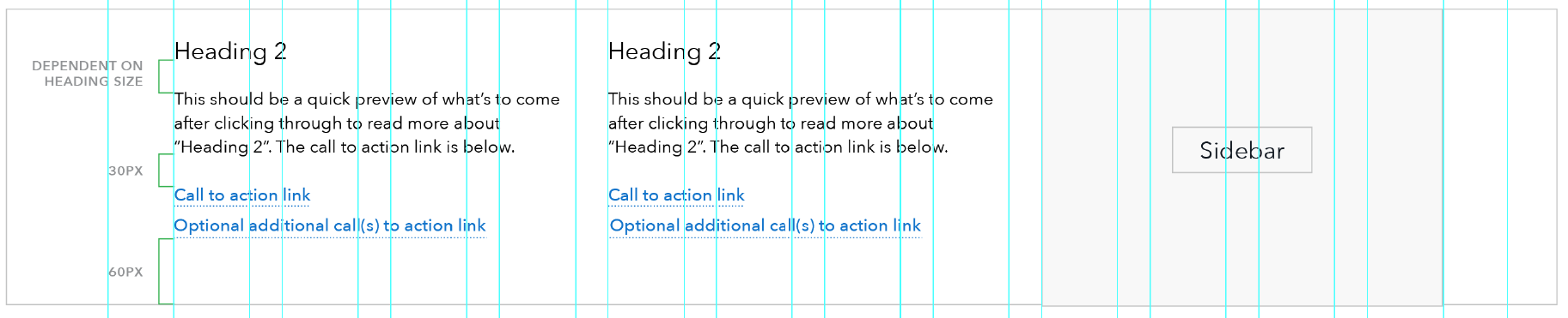
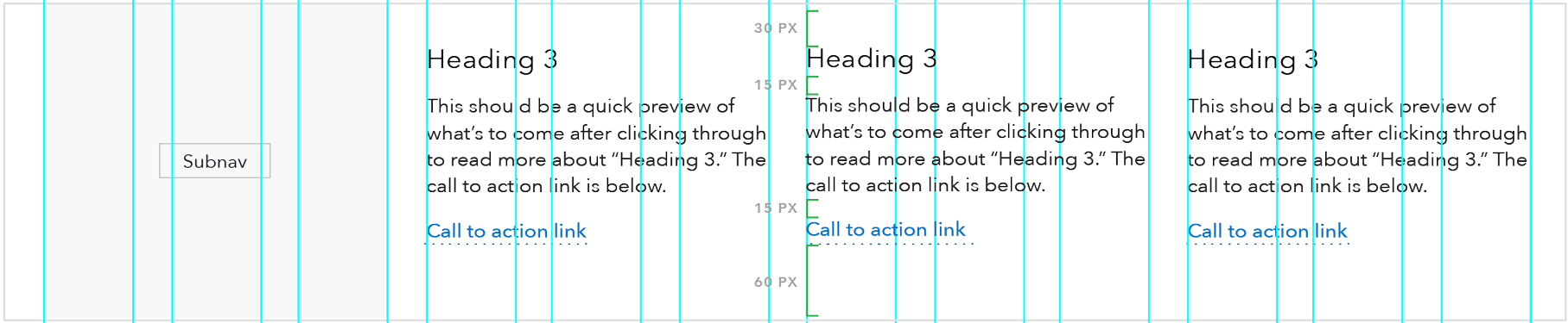
A link blob is a unit consisting of heading, short descriptive text, and call to action. At breakpoints above 601 px, link blobs are found in rows of two blobs (half-width link blobs) or three blobs (third-width link blobs).
Half-width link blob

When to use
- Ideally, when an even number of these components can be featured together.
When other options are better
- When the number of components would be better featured in multiples of 3, use the third-width link blob.
- When content requires imagery, use the 50/50 image and text or 25/75 image and text components.
HTML code snippet
Jinja code snippet
File in https://github.com/cfpb/cfgov-refresh:

https://github.com/cfpb/cfgov-refresh/blob/e67d1ad321551c221c01eaa62589dfdd1177d1dc/cfgov/jinja2/v1/_includes/organisms/half-width-link-blob-group.html
Specs
- Headings: Use H3 or H4. Do not use both.
- H3: Use when you wish to give the blob heading text a higher level of prominence within the page hierarchy. Avoid using H3 when it will cause the heading to break to 3 lines or more.
- H4: Use when you wish to give the heading text less prominence within the page hierarchy or when the blob set follows an H3 heading. When you select the H4 you have the option of including a minicon to the left of the heading.
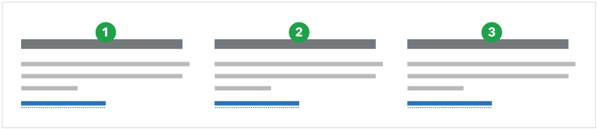
Third-width link blob

When to use
- Ideally, when a group of these components can be featured together in multiples of three (3, 6, 9, etc.).
When other options are better
- When the number of components would be better featured in multiples of 2, use the half-width link blob instead
- When headings are too long for the narrower width, for example, when they break to 3 lines or more.
- When content requires imagery, use the 50/50 image and text or the 25/75 image and text instead.
HTML code snippet
Jinja code snippet
File in https://github.com/cfpb/cfgov-refresh:

https://github.com/cfpb/cfgov-refresh/blob/e67d1ad321551c221c01eaa62589dfdd1177d1dc/cfgov/jinja2/v1/_includes/organisms/third-width-link-blob-group.html
Specs
- Headings: Use H3 or H4. Do not use both.
- H3: Use when you wish to give the blob heading text a higher level of prominence within the page hierarchy. Avoid using H3 when it will cause the heading to break to 3 lines or more.
- H4: Use when you wish to give the heading text less prominence within the page hierarchy or when the blob set follows an H3 heading. When you select the H4 you have the option of including a minicon to the left of the heading.
Content guidelines
Do not use blobs for multiple paragraphs of copy. Copy should be succinct.
- Headings
- 45 characters max. 25 characters max is preferred, which renders as one line at max column width.
- Descriptions
- Half-width link blobs: 100-250 characters max
- Third-width link blobs: 90-150 characters max
- Call to action
- Half-width link blobs: 40 characters max
- Third-width link blobs: 30 characters max
- Follow link guidelines.
- When these components are featured together (which is ideal), the amount of content in each component should be as close to the same number of total lines as possible.
- For half-width link blobs, one or two lines different is ok
- For third-width link blobs, a difference of one line is ok
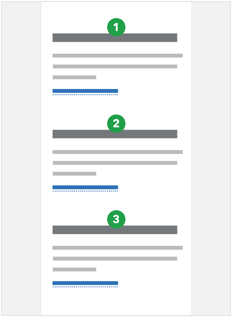
Behavior
At breakpoints below 601, side-by-side modules stack vertically in Z-order as shown below, and the mobile link style is used for the call to action link(s)
Half-width link blob
| Above 600 px | Below 601 px |
|---|---|
 |
 |
Third-width link blob
| Above 600 px | Below 601 px |
|---|---|
 |
 |