Bar Charts
Use bar or column charts to show comparisons of different discrete items, factors or categories. Comparisons could include items that can be counted and categorized. These are some of the easiest charts to interpret because the data is shown by length of bar.
Information about Bar Charts can be found at:
http://cfpb.github.io/design-manual/data-visualization/chart-types.html#bar-or-column-charts
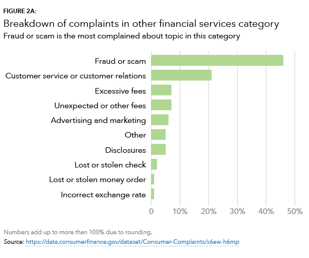
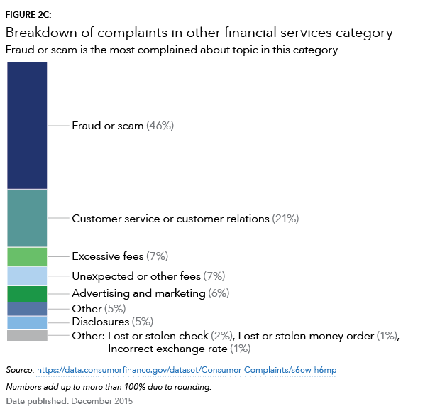
Simple bar chart
HTML code snippet
<marquee>Some sample code will eventually show up here.</marquee>Jinja code snippet
* [_includes/organisms/chart.html](https://github.com/cfpb/cfgov-refresh/blob/master/cfgov/jinja2/v1/_includes/organisms/chart.html)
* [_includes/organisms/mortgage-chart.html](https://github.com/cfpb/cfgov-refresh/blob/master/cfgov/jinja2/v1/_includes/organisms/mortgage-chart.html)
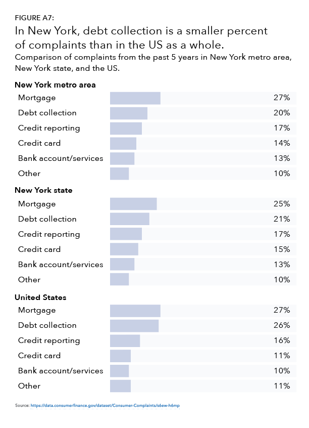
* [_includes/organisms/mortgage-map.html](https://github.com/cfpb/cfgov-refresh/blob/master/cfgov/jinja2/v1/_includes/organisms/mortgage-map.html)Grouped bar chart
HTML code snippet
<marquee>Some sample code will eventually show up here.</marquee>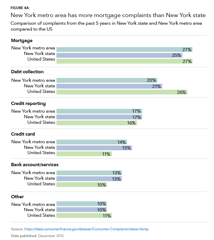
Content guidelines
- If exact numbers are important, the bars should be labeled with the value.
- When possible label directly rather than relying on color.
- For stacked charts, use a white line or stroke to create contrast between bar chunks.