E-mail Signup Forms
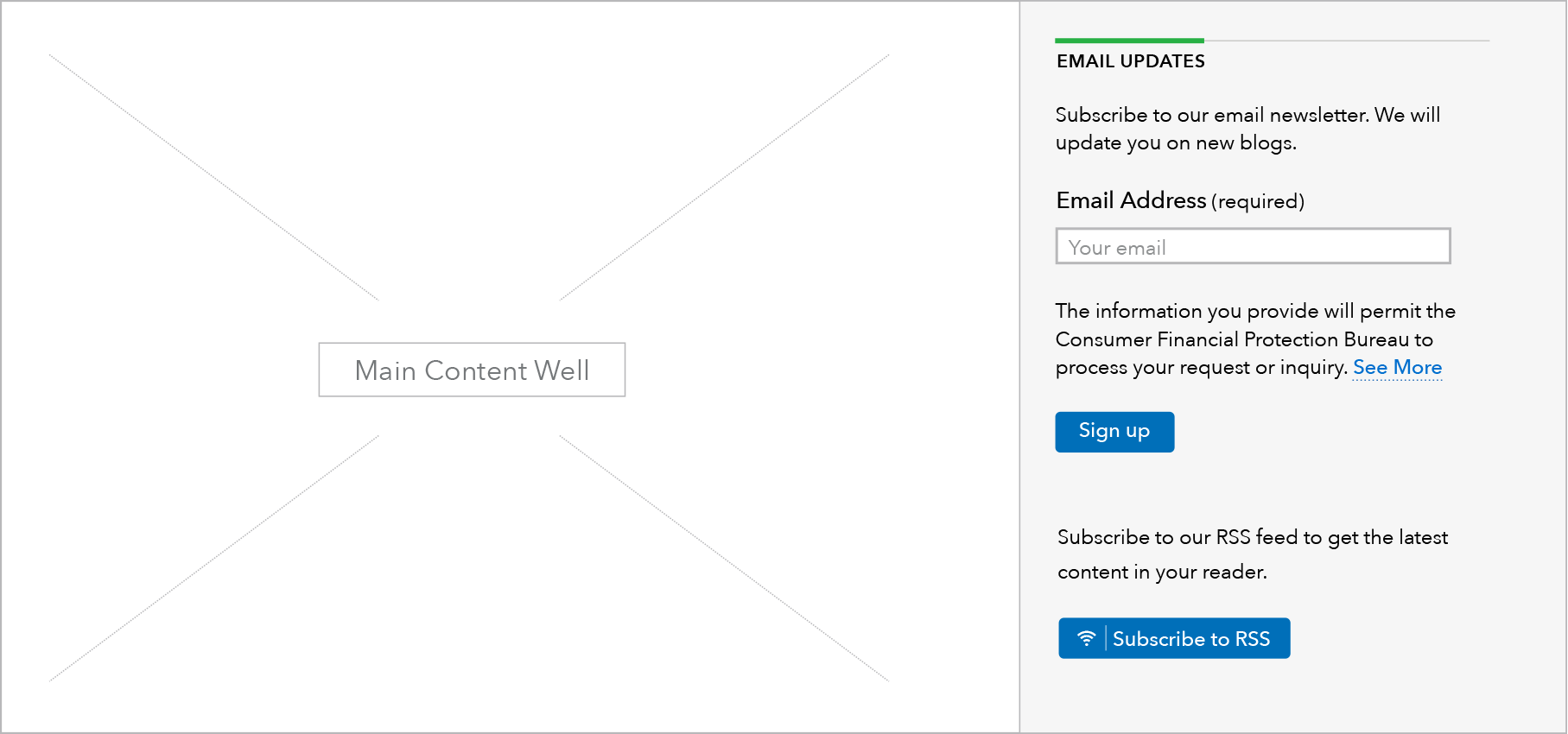
Email sign-ups allow users to stay engaged on a specific topic or content type produced by the Bureau. They are used to add individual email addresses to a specific mailing list that is relevant to the content on the page or the section it is contained within.
More information can be found at:
http://cfpb.github.io/design-manual/page-components/email-sign-up.html
Types
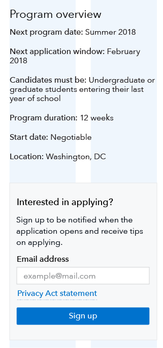
The email sign up form is comprised of standard slug text (“Email updates”), custom description text, a form field for the user to enter their email address, a standardized link to a privacy policy statement, and a standardized sign up button.
Different page types will be connected to the corresponding GovDelivery list based on the page topic (i.e. HMDA) or page type (i.e. blog).
Inset email sign up
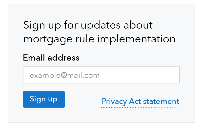
The inset email signup module is a variation on the main email signup that can be used in the body content of Learn and Browse pages. It should be used when the email CTA is more important to the purpose of the page than the sidebar or prefooter placement reflects.
When to use inset email signup
- On Learn pages, only use the inset email module when signing up for the email list is a primary user goal for the page, for example job seekers signing up for job announcements.
- On Browse pages, use the inset email module when feedback modules or other prefooter content competes with the prefooter email signup CTA, or when signing up for the email list is a primary user goal.
When other options are better
- On Learn pages when we want to encourage visitors to sign up for an email list but the list itself is not a primary user goal, use the standard sidebar email signup.
- On Browse pages, when email signups are not a primary user goal, and the prefooter/end of page content has no other CTAs to compete with the email signup, use the standard prefooter email signup.
HTML code snippet
Content guidelines
- Use standard slug text: “Email updates”
- Description text will be unique to each mailing list and should clearly set expectations for what a user will receive as a result of signing up. Email address field should always be marked required.
- Use standard helper text within form field: “john@example.com” and standard privacy policy text before the button.
- Use standard button text: “Sign up”
Inset
- The module heading should provide a strong call to action that clearly sets expectations for what a user will receive as a result of signing up.
- Uncheck “Default heading style” to get the alternate heading style that we want in this inset module
- The additional body text can further clarify what kind of information will be in the emails, with a focus on the value users will receive from the emails.
- The placement of the email signup on the page should not interfere with the primary page goal. Users respond better to follow-on requests that happen after their primary goal has been met.
Behavior
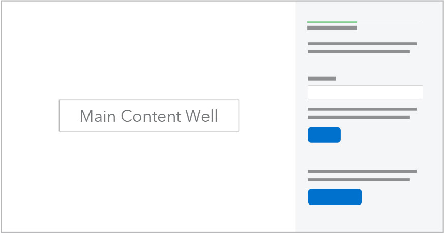
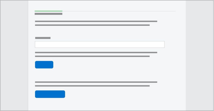
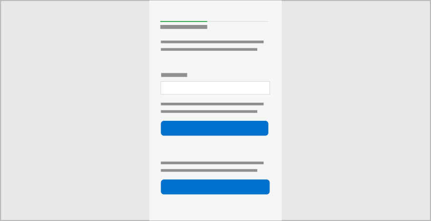
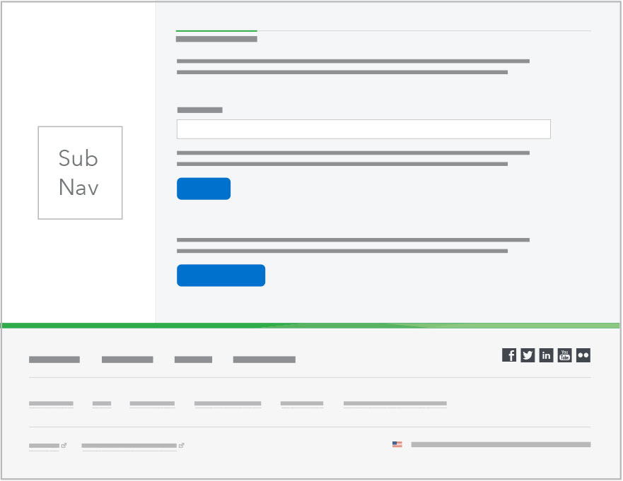
The mockups below show simultaneously how this pattern works within either a sidebar or a prefooter area.
Sidebar email sign up module: Sublanding pages
At breakpoints below 601: Heading sizes H3 and above automatically drop down one level and the mobile link style is used for the call to action link(s).
| Above 900 px | 601-900 px | Below 601 px |
|---|---|---|
 |
 |
 |
Sidebar email sign up module: Browse pages
Browse pages do not have a sidebar. The sidebar email sign up module appears in the prefooter at the bottom of the page.
For breakpoints below 601, heading sizes H3 and above automatically drop down one level and the mobile link style is used for the call to action link(s).
| Above 600 px | Below 601 px |
|---|---|
 |
 |
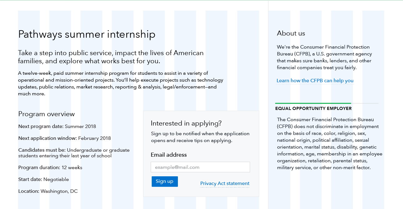
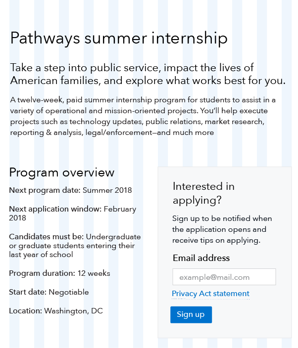
Inset
When the inset module is wide enough, the Privacy Act statement link is displayed inline with the sign up button, right-aligned.
At breakpoints below 601px, the inset module transitions to a single column and stacks above the full-width text. The signup button extends the full width of the module at the smallest breakpoint, 320px.
| Above 900 px | 601-900 px | Below 601 px |
|---|---|---|
 |
 |
 |
