Landing pages
Landing page types provide an overview of a main navigation section and helps users situate themselves within the site and the subject matter. Their main function is to preview the different sub-pages within that section and help users quickly skim section topics and select the category that interests them.
Types
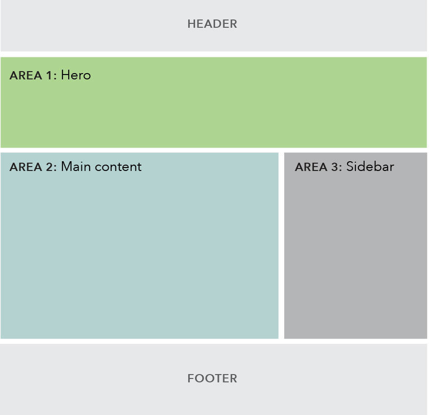
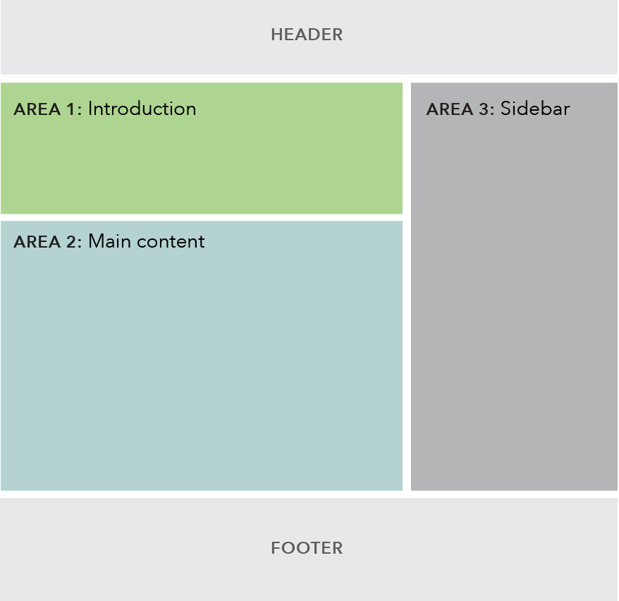
There are two landing page templates. One uses a hero at the top of the page, and the other uses a text introduction.
| Landing page with hero | Landing page with introduction |
|---|---|
 |
 |
Use cases
When to use
- The landing page template should only be used for the top-level page under each main navigation section on the site to help users navigate to the various sub-sections within the navigation vertical. Examples: Data & research overview, Policy & compliance overview.
- This template may also be used for campaign pages.
When other options are better
- When a new page is needed within a navigation section, rather than at the top-level.
- When page content includes paragraph copy or more detailed definitions or explanations.
Content guidelines
- Generally, content components should work together to provide an overview of the information organized below this page or about the campaign. Give users clear next steps and calls to actions so they can quickly decide what content is relevant to them and where they should go next.
- This page should be written and organized in a way that aids the user in skimming and quickly navigating to lower-level pages.
- Page titles are sentence case and use the word “and” instead of “&”. (Note that navigation labels follow a different style.)
- Email signup component should only be used on campaign landing pages. This component is not used on Landing pages.
Area 1: Introduction
- Choose between a hero or text introduction for this area.
Area 2: Main content
- Must contain at least 1 component.
- Recommended hierarchy of components: image & text components, gray well, and half width link blobs.
- The gray well component should not be used at the top of this area if the introduction area contains a hero.
Area 3: Sidebar
- Must contain at least 1 component.
- If using both static and dynamic content, preference for dynamic content to appear above static content.
Behavior
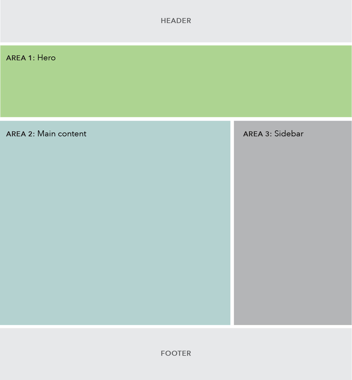
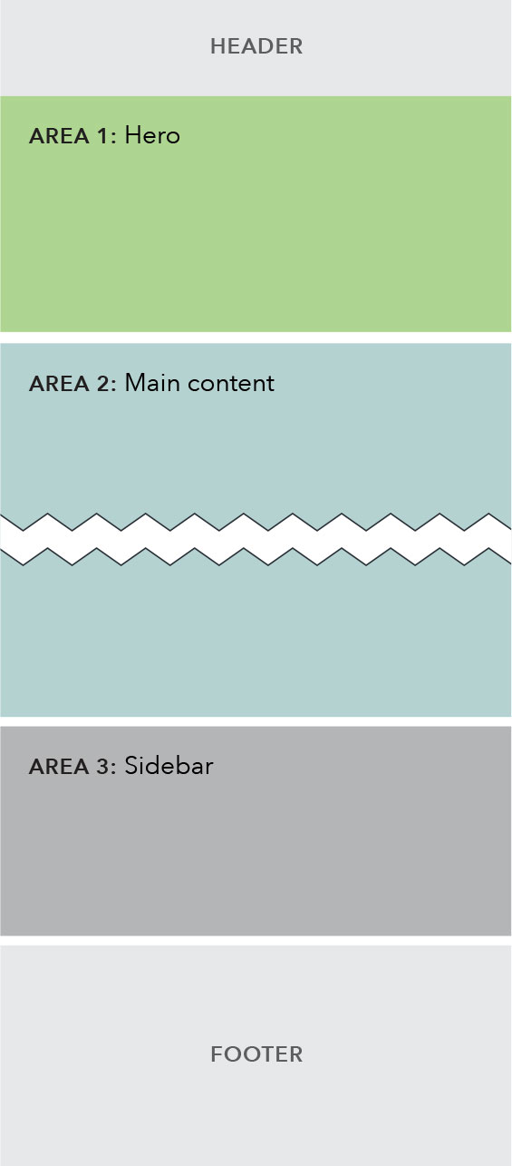
Below the 901 pixel breakpoint, the entire sidebar stacks below the main content area, appearing near the bottom of the page for mobile and tablet users.
| Above 900 px | Below 901 px |
|---|---|
 |
 |
Related Items
- Text introduction
- 50/50 image & text
- 25/75 image & text
- Half width link blob
- Gray well
- Related posts / Related links
- Email signup